No surprise I absolutely love these prints by Matthew Williamson for Osbourne and Little- particularly 'Jungle beat' used to upholster these chairs...
This wallpaper by Cole and Son is pretty cool too.
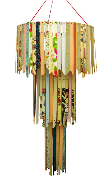
I've started on my bedroom on the house, I already had lots of bright throws and cushions, but need to finish making the curtains, get a few more furniture bits and light fittings.
I've gone for yellows, oranges and greens , which although pretty vibrant it's a harmonious colour scheme...
Which is a group of hues that sit next to each other on the colour wheel- this means it's quite calming and subtle. So although the main colours I've chosen for the bedroom are vibrant, they are easy on the eye and make a good blend. I can add different, more suble tones of these hues, with painted walls and further accessories to calm everything down if I decide it's a bit bold.
I've added these little hand made paper mâché storage baskets in for even more colour!


No comments:
Post a Comment